We live in a world of monotone software. It isn't all the same, but it sure does feel that way. Go look at the Wayback Machine for, say, 2005. Different websites felt different.
Today, though, you can jump between a dozen different sites and feel like you're wandering different aisles in the same grocery store. The inventory might be different, but there's no change in how they make you feel. Why is that the case now when it wasn't the case a decade ago?
It's my position that it's due to:
- An over-correction away from meaningless skeuomorphism, and
- A scale-at-all-costs mentality that has saturated the software world.
Let's dig into both of these, how they've combined to create our current landscape, and where to look for a better future.
Meaningless Skeuomorphism
When I consider a design problem, I use a rough model in my head to organize what I'm trying to create. I may not always be explicit about it, but all software features end up organized like this:
- Culture: What are the assumptions you can make about the intended users?
- Element: What is the activity you want to enable for the user?
- Form: What is the method you'll use to display the activity?
We have a simple and easy-to-understand example by looking at the bass-adjustment feature in Logic Pro:
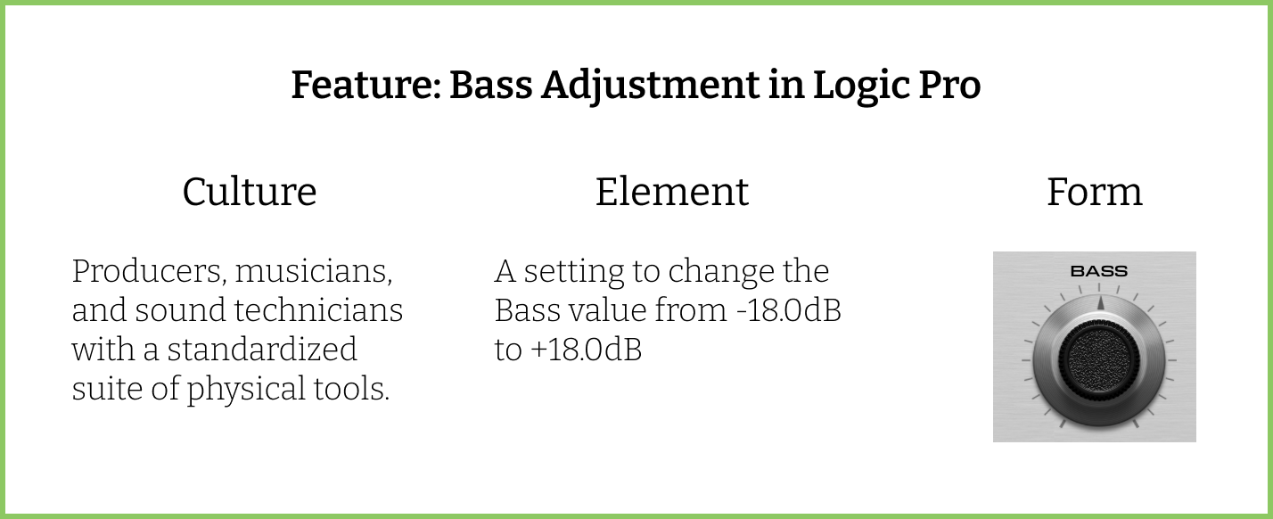
You'll notice that the culture and element could've taken on any number of forms. A toggle, a number-input, a slider, or some other clever adaptation of a physical input. All of those would have been fine! But what makes this a first-rate design is that the form pulls directly from the culture, without obfuscating the element.
For a contrasting example, let's look at the pre-iOS 7 Notes app on iPhone. In particular let's look at the header:

It's hard to see, but that little pixelated bottom-shadow is actually a simulated torn piece of paper. This is going after the effect that you have with a physical yellow legal pad when you tear a page off and part of it remains suck to the binding. To the designer's credit, they did a great job of replicating that real-world effect. But let's consider it through the model above:
- Culture: People who want to take quick, locally-stored notes on their phone.
- Element: A navigation header that will appear at the top of all notes in any state.
- Form: Torn paper that indicates a note has been removed.
As part of the top-level navigation header, this decoration is extremely prominent. Yet, we see a breakdown between element and form. It's a form that takes away from the element by confusing the user. Is it indicating a note has been removed? That there are a limited number of notes before you run out of space? That these notes have a fixed width and height? Nope! Just a decoration!
I don't want to obsess too much over this one detail. Rather, I bring it up because by 2012 there was a growing frustration with the decorative skeuomorphism of iOS driven by features like this. As the most influential platform, the design language had (and has) a large influence on broader software design trends. So, when iOS 7 was released, it provoked a titanic correction away from meaningless skeuomorphism that was rightly celebrated.
The future was clear: decorative flourish was out, flat was in. Crisp lines replaced faux leather. A world of undiscovered beauty was ahead, waiting only to be charted by intrepid designers. It would have been beautiful if not for the economic conditions it collided with.
The Cost of Scaling
As has been discussed widely, the 2010's brought VC firms with massive funds, an incredible number of deals, and eye-popping valuations. The underlying premise was that firms just needed a couple of big wins to make their funds work, even if 99% of their portfolio went bankrupt. This inherent pressure caused niche businesses to try to adopt a model that shot for a unicorn valuation that realistically should've just been a healthy lifestyle business.
How does this tie into the evolution of software design over the last decade? By warping the intended audience of most software. We had seen a reset on Element and Form made popular by Apple's iOS 7 update. The reset of Culture was driven by VC firms.
There are very few forms that are universally appropriate for the entire world. As an example, let's stick with note-taking. The yellow legal pad is popular in the United States. Yet, Japan is famous for a completely different style of notepad (I'm an ardent Mnemosyne-user, personally). Meanwhile, in Germany, you have notebooks like Hahnemühle's Iconic. If you were making a notes app for any of these cultures, you'd likely embrace a different form depending on what was already popular. The element (note-taking) may be static, but the form would be changed by the culture.
When it comes to scale-at-all-costs, there is an inherent assumption that your audience is — at least — all of North America, and for most startups there's some long-term vision of "the entire world." There aren't many paths to getting investment without promising an eventual exit in the billions, and there aren't many ways to chart that path to 10-figures without making the entire world your market. While that looks great in a pitch deck, it implicitly changes the design framework. It takes the breadth of possible cultures and flattens them into a mono-culture.
The end result is unavoidable: without unique culture inputs, form outputs will converge.
Over the last decade we've had a hard — but fair — correction away from skeuomorphism driven by a combination of better hardware, different taste, and bad memories of faux-leather. At the same time, we've had a generation of companies assume that everyone is a potential customer and that a culturally-specific form has no upside.
What this does is make everything feel the same even if the element is completely different. You have a world of websites that are all roughly the same few colors because they're found to be universally acceptable. You have businesses that have nothing in common with each other, but when you go to their apps they feel the same. If you spend more than a few minutes using the most popular platforms and tools you've experienced this.
To put a point on this: it's boring.
The Promising Exceptions
Yet, even as you've been reading you've likely thought of exceptions. And you're right! There are beautiful apps and websites that have come out that buck this trend. Two that come to mind are Playdate and Orion. They're wonderful examples of technology that embrace charm. Yet, though I don't know the creators of either, I think it's safe to assume that they aren't pursuing some billion-dollar valuation.
Which I think points to where the great designs are going to come from. They're going to come from teams that aren't focused on being universally popular, that are going to make opinionated decisions that they know will be unpopular with some people, and they're going to be in niche verticals. Which is why if you want to explore innovative and compelling design those are the teams you'll want to gravitate towards.
Note: I'm not a designer, but I do think about it a lot. Get in touch with your own opinions! Trevoragilbert [at] gmail [dot] com.